04 — Creative Development
Marina Yee — One Corner Off
- Year
- 2026
- Role
- Research, visual design, interaction design and front-end development
- Context
- Devine (Howest) — Integration 3, for MoMu Antwerp
- Stack
- Vite, JavaScript, GSAP, CSS
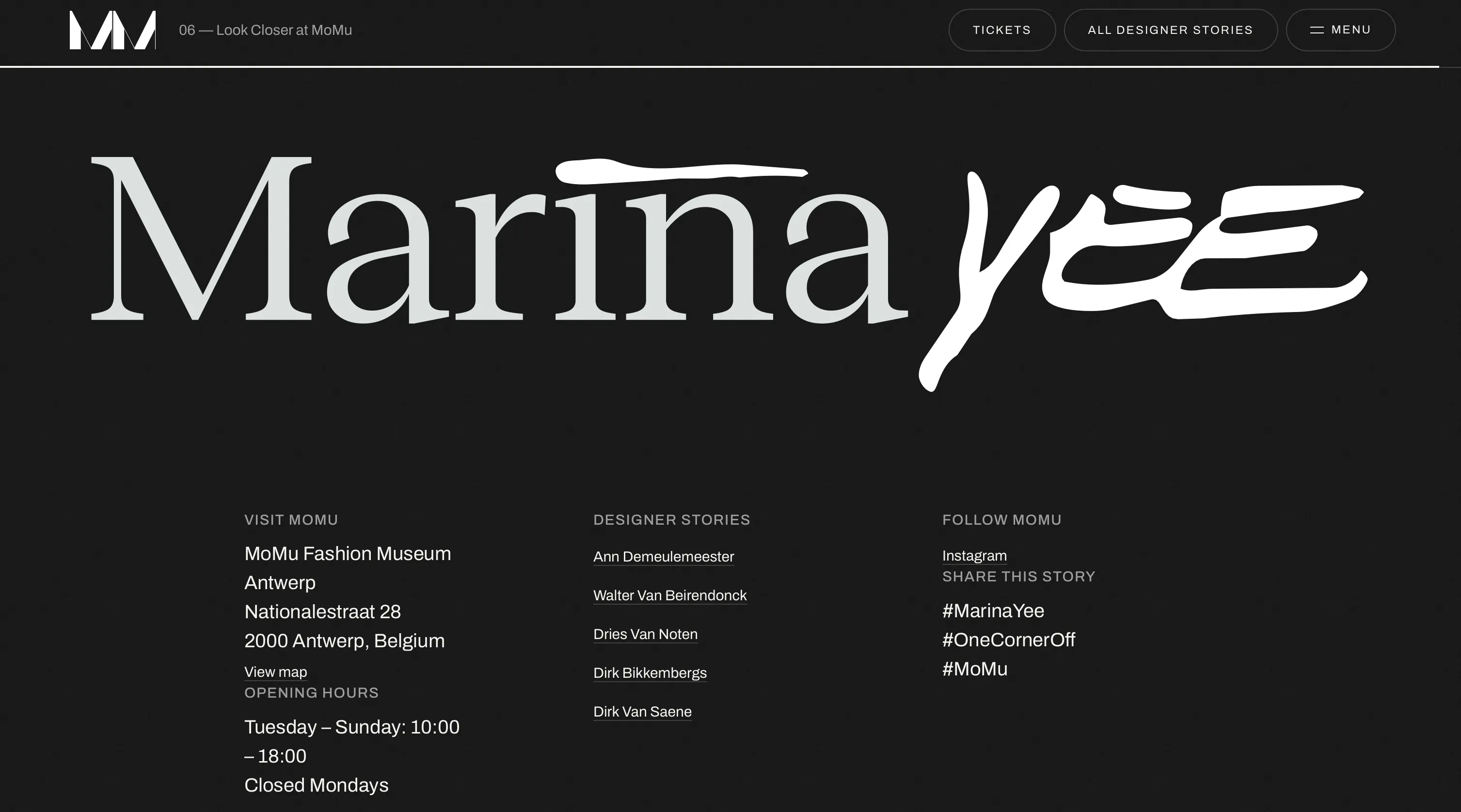
An interactive longread about fashion designer Marina Yee, developed for MoMu, the Fashion Museum Antwerp.
Visit the websiteThe project
The project
The project focuses on Yee’s approach to reconstructing existing garments rather than her association with the Antwerp Six. The title references a Flemish expression she used to describe her process: making something appear finished before deliberately altering it.
Read more Read less
One Corner Off is an interactive longread about fashion designer Marina Yee, developed for MoMu, the Fashion Museum Antwerp.
I was responsible for the research, visual design, interaction design and front-end development.
The main objective was to create an editorial website that combined long-form content with meaningful interactions while remaining responsive, accessible and performant.
Design process
The visual direction went through several iterations, including editorial collage, monochrome layouts and more experimental compositions inspired by fashion publications.
Read more Read less
After receiving feedback, I evaluated individual sections rather than redesigning the entire website. Four sections were particularly successful: the cover, the horizontal chapter, the rotating paragraphs and the closing spread.
I used their shared characteristics to establish a consistent visual system: oversized typography, strong contrast, layered photography, limited colour and references to printed fashion publications.
This approach helped me refine the design while keeping the strongest elements from previous iterations.
The four sections that worked
-
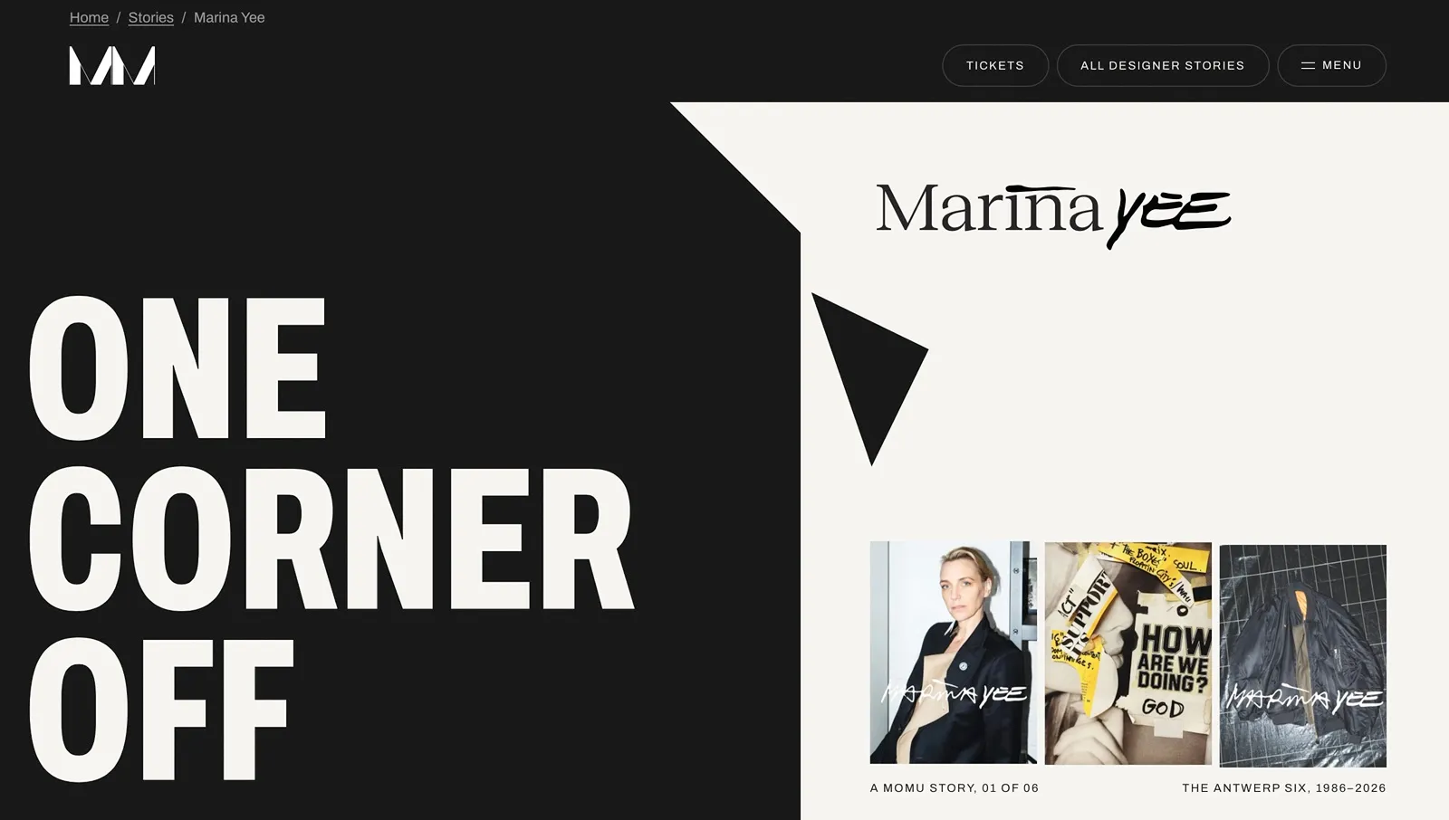 The cover
 -
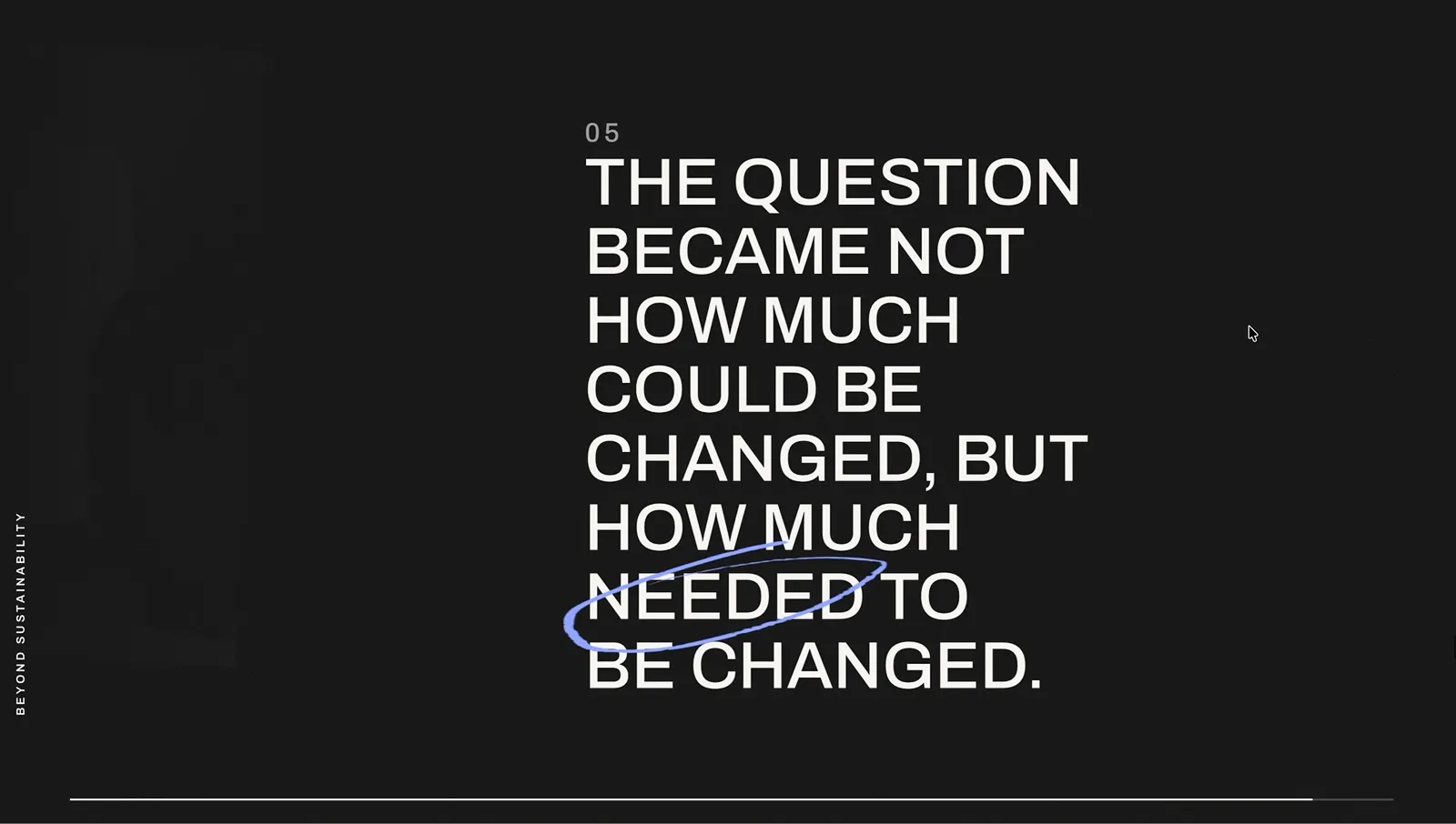 The horizontal chapter
 -
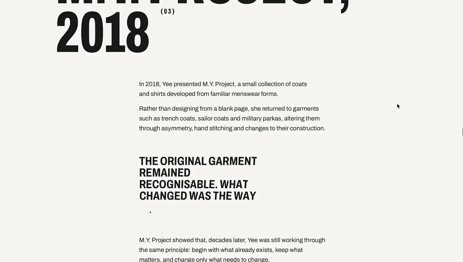 The rotating paragraphs
 -
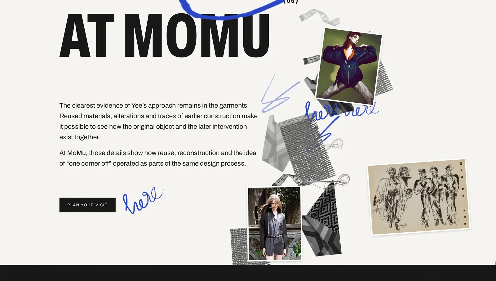 The closing spread
Visual design
Layout and typography
The website alternates between dark editorial spreads and lighter reading sections.
Read more Read less
Dark sections use oversized condensed typography, justified text and overlapping photographs. Lighter sections use narrower text columns and more whitespace to improve readability.
I chose Archivo as the primary typeface because its variable width and weight axes support both display typography and body text within a single font family. Reenie Beanie is used for handwritten annotations.
The layout uses a combination of CSS Grid, subgrid and flexible containers, depending on the content and interaction requirements.
Archivo · width 62 · weight 800
Make it look finished, then disturb it.
Colour and imagery
The palette consists primarily of black, white and warm paper tones, with biro blue for annotations and red for paper clips.
Read more Read less
Photographs are presented as physical prints using borders, shadows and slight rotations. Some are accompanied by SVG paper clips, while handwritten elements are recoloured using SVG filters.
Colours, typography and spacing are managed through CSS custom properties. Sections switch between light and dark themes using a data-theme attribute, avoiding repeated colour definitions throughout the stylesheets.
- Black
- Paper
- White
- Biro blue
- Red
Interaction design and development
Cover: detachable corner
The cover introduces the project’s visual concept through a large typographic composition with a detachable corner.
Read more Read less
I used a CSS clip-path, controlled through a custom property and animated with GSAP, to remove the corner from the title block.
The detached piece falls into place and can be dragged and thrown using the cursor. As the user scrolls, the title separates and surrounding photographs move at different speeds.
This establishes the interaction language used throughout the website.
Spotlight: pinned scroll animation
The spotlight section uses GSAP ScrollTrigger to transition from Yee’s association with the Antwerp Six to her individual work.
Read more Read less
The section remains pinned while the spotlight and its typography shrink towards the centre. Photographs of garments, sketches and studio material enter from outside the viewport.
I calculated the images’ movement using layout values rather than element bounding rectangles to keep their positions consistent when refreshing ScrollTrigger.
The animation is tied to scroll progress, allowing the reader to control the transition.
Garment index: interactive content selection
I designed the garment section as an interactive index rather than a conventional image gallery.
Read more Read less
Four categories are displayed using oversized outlined typography. Selecting a category fills its title and displays the corresponding garment, description and detail photographs.
The interface uses native radio inputs. CSS handles the selected appearance, while JavaScript manages panel visibility.
On larger screens, CSS subgrid allows the index, text and garment photography to share a consistent layout.
I also kept the section height consistent between selections. This prevents content changes from affecting the measurements of pinned sections further down the page.
Typography animations
Several sections use typography as the primary interactive element.
Read more Read less
One chapter contains two paragraphs positioned in the same space. Individual lines rotate along the Y-axis to reveal the second paragraph, using CSS 3D transforms and GSAP.
Both paragraphs follow the same staggered timing to maintain alignment throughout the transition.
Another section uses an oversized horizontal marquee. Individual characters animate between font weights by changing Archivo’s variable weight axis as they move across the viewport.
These interactions use transforms and font properties rather than repeatedly changing the document layout.
M.Y. Project: image sequence
The M.Y. Project section presents seven garments sequentially within a single frame.
Read more Read less
The section is pinned while each garment is revealed through an upward clip-path transition. The corresponding title rolls into position beside the image, and a counter updates based on the animation timeline.
I coordinated the image transitions, typography and counter within one GSAP timeline to keep the sequence synchronised.
The section also transitions from a light to a dark theme, connecting it visually to the following chapter.
Beyond sustainability: horizontal scrolling
I developed this chapter as a horizontal sequence of five full-screen panels.
Read more Read less
GSAP ScrollTrigger controls the movement of the horizontal track. Individual panels use containerAnimation to trigger their text reveals as they enter the viewport.
Archive photographs move independently at different speeds, with their positions calculated relative to viewport dimensions rather than the full track width.
The final panel includes another detachable corner, repeating the interaction introduced on the cover.
Main interaction: folding the page
The most technically complex component is an interactive paper fold developed entirely in vanilla JavaScript.
Read more Read less
A black page covers a photograph of an M.Y. garment. Users can drag the page’s corner to fold it backwards and reveal the image underneath.
Geometry and implementation
The fold is calculated from two points: the original corner of the page and the pointer’s current position.
These points define a crease positioned halfway between them and perpendicular to the line connecting them.
I implemented a Sutherland–Hodgman polygon-clipping algorithm to divide the page along this crease.
The remaining polygon becomes the visible page through CSS clip-path. The removed polygon is reflected across the crease to create the folded flap.
The flap uses separate elements for its shape and shadow because clip-path would otherwise clip the shadow.
CSS gradients provide shading along the crease, with their positions calculated in JavaScript.
The fold position is stored as relative coordinates, allowing it to remain consistent when the page is resized.
Interaction and accessibility
The component supports dragging, tapping and keyboard interaction.
The corner is implemented as an ARIA slider, allowing users to adjust the fold using arrow keys, Home and End. A reset button returns the page to its original state.
For users who prefer reduced motion, the fold remains interactive, but animated easing is disabled.
I chose to implement this interaction without an animation library because it required direct geometric manipulation rather than a predefined animation sequence.
Under the hood
Responsive design and accessibility
The website follows a progressive enhancement approach. The HTML contains the complete content, while JavaScript adds interactions and scroll-based animations.
Read more Read less
Without JavaScript:
- The garment index displays all four looks.
- The M.Y. Project becomes a static image grid.
- Horizontal sections use a vertical layout.
- The folding page becomes a static composition.
I check prefers-reduced-motion before dynamically importing GSAP and the motion modules. This prevents unnecessary animation dependencies from loading.
Other accessibility decisions include native form controls, visible keyboard focus states, descriptive image alt text, ARIA live regions and hiding decorative duplicates from assistive technologies.
For draggable elements, touch-action: none is limited to the interaction handles so users can still scroll normally on touch devices.
ScrollTrigger architecture
The website contains six pinned ScrollTrigger sections.
Read more Read less
Because pinned sections introduce additional scroll distance, their initialisation order affects the positions of subsequent triggers.
I initialise them from top to bottom and assign explicit refreshPriority values to ensure accurate measurements.
Text-based animations wait for document.fonts.ready before calculating line positions. Once all sections have been initialised, ScrollTrigger.refresh() recalculates the page.
I also designed components to avoid unnecessary layout changes after initialisation. For example, the garment index maintains a consistent height regardless of which garment is selected.
These decisions reduce incorrect trigger positions and layout shifts during scrolling.
Tooling and performance
The initial JavaScript bundle is approximately 11.7 KB (4.6 KB gzipped), with 40.6 KB of CSS (8.7 KB gzipped).
Read more Read less
Image optimisation
I created two Node.js image-processing workflows.
npm run images uses Sharp to generate responsive WebP variants. Images use srcset, sizes, lazy loading and asynchronous decoding.
npm run cutouts removes neutral studio backgrounds from garment photographs using edge-based flood filling. The script preserves soft shadows where possible and generates transparent cutouts for use in the layouts.
Code quality
The project uses ESLint, Stylelint and Prettier.
A combined npm run check command runs linting, formatting checks and a production build.
Development follows GitHub Flow, using feature branches and pull requests to organise changes.
Bundle optimisation
GSAP and its plugins are loaded dynamically, adding approximately 64.6 KB gzipped only when motion is enabled.
Using a single variable font family for most typography also reduces the number of font files required.
- 4.6 KB initial JavaScript, gzipped (11.7 KB raw)
- 8.7 KB CSS, gzipped (40.6 KB raw)
- 64.6 KB GSAP, loaded only when motion is enabled
Looking back
What I learned
The design process taught me to work more effectively with feedback. Evaluating individual sections helped me identify successful patterns and develop a consistent visual system without repeatedly starting over.
Read more Read less
The main technical challenge was coordinating multiple scroll-driven interactions while maintaining layout stability. I learned how pinning, font loading, responsive dimensions and content changes affect ScrollTrigger calculations, and how to structure the page to avoid those issues.
Developing the paper-fold interaction also strengthened my understanding of geometry, clipping algorithms and pointer-based interaction. It required building the behaviour from scratch rather than relying on an animation library.
Overall, the project gave me more experience connecting editorial design decisions with front-end architecture, particularly when building complex interactive websites that also need to remain accessible and responsive.
Walkthrough
 momu-marina-yee.netlify.app Visit the website